


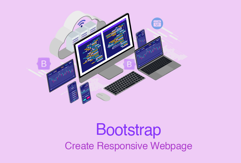
Web Development has evolved significantly over the years, with new tools and frameworks continuously being developed to streamline the process. One such tool that has become indispensable for modern web developers is Bootstrap. Developed by Twitter, Bootstrap is a powerful Front-End framework that simplifies the creation of responsive and aesthetically pleasing websites. In this comprehensive guide, we'll delve into how you can efficiently incorporate Bootstrap files into your workflow to enhance productivity and ensure your web designs are both functional and attractive.
Understanding Bootstrap and Its Benefits
Bootstrap is an open-source toolkit for developing with HTML, CSS, and JS. It includes a wide range of
components such as navigation bars, buttons, forms, and modals, which can be easily customised to fit the
specific needs of your project.
Here are some key benefits of using Bootstrap:
- Responsive Design: Bootstrap's grid system and responsive utilities make it easy to create layouts that adapt to various screen sizes and devices.
- Consistency: Using a standardised framework ensures a consistent look and feel across different parts of your website.
- Speed and Efficiency: Pre-designed components and a robust grid system allow developers to build websites more quickly than starting from scratch.
- Community and Support: With a large community of users and contributors, finding solutions to problems and accessing a wealth of resources is straightforward.
Setting Up Your Project
Before incorporating Bootstrap into your project, it’s essential to establish a well-organised project structure. A typical structure might include directories for CSS, JavaScript, images, and Bootstrap files. This organisation helps in maintaining clarity and ease of access as your project grows.
Including Bootstrap Files
There are two primary methods for including Bootstrap in your project: using a Content Delivery Network (CDN) or downloading the files locally.
Using a CDN
A CDN is a network of servers distributed globally that deliver content to users based on their geographic location. By linking to Bootstrap via a CDN, you can ensure that your users load the files from a server that is geographically close to them, which can improve loading times.
Downloading Bootstrap Locally
For more control over the files and offline development, you can download Bootstrap from the official website and include the files in your project directory. This method allows for greater customization and ensures that your site will work without an internet connection.
Customising Bootstrap
Bootstrap is designed to be easily customizable. This means you can override its default styles and components to better fit the unique needs of your project. Customization can be achieved through:
- Custom CSS: By creating a separate CSS file and including it after the Bootstrap CSS file, you can override the default styles.
- Sass Variables: Bootstrap is built using Sass, a preprocessor that extends CSS with variables, nested rules, and more. By modifying Bootstrap’s Sass variables, you can change the look and feel of your project without writing extensive custom CSS.
- Theming: Bootstrap provides a simple theming mechanism that allows you to change the appearance of components across your entire site.
Incorporating Bootstrap Components
Bootstrap offers a plethora of pre-designed components such as buttons, forms, navigation bars, modals, and more. Utilising these components can significantly speed up the development process. Here are a few tips for effectively incorporating Bootstrap components into your workflow:
- Start with the Documentation: Bootstrap’s official documentation is comprehensive and well-organised. Familiarise yourself with the available components and their usage.
- Experiment and Prototype: Use Bootstrap components to quickly create prototypes and experiment with different layouts and designs.
- Modify as Needed: Don’t be afraid to customise Bootstrap components to better fit your project’s needs. This might involve changing colours, sizes, or even the structure of the components.
Bootstrap’s Grid System
One of Bootstrap’s most powerful features is its grid system. The grid system allows you to create complex layouts with ease, using a series of rows and columns. Understanding and effectively utilising the grid system is key to creating responsive designs.
Key Concepts of the Grid System
- Container: The container is the basic layout element that centers your content and sets the width of the layout.
- Rows and Columns: Rows are used to create horizontal groups of columns. Inside a row, you can create up to 12 columns.
- Breakpoints: Bootstrap’s grid system is responsive, which means it automatically adjusts the layout based on the screen size. Breakpoints define the sizes at which the layout changes.
Best Practices for Using the Grid System
- Plan Your Layout: Before diving into code, sketch out your layout to determine the number of rows and columns you’ll need.
- Use Nested Columns: For more complex designs, you can nest columns within other columns.
- Utilise Responsive Classes: Bootstrap provides responsive classes that allow you to specify different column sizes for different screen sizes. This ensures your layout adapts seamlessly to various devices.
Keeping Bootstrap Updated
Regular updates to Bootstrap include new features, improvements, and security patches. It’s important to keep your Bootstrap files updated to benefit from these enhancements. If you’re using a CDN, updates are automatic. For local files, periodically download the latest version from the Bootstrap website.
Integrating JavaScript Components
Bootstrap includes a variety of JavaScript components such as modals, carousels, and tooltips. These components are built using Bootstrap’s JavaScript and require jQuery and Popper.js. Here are some tips for integrating JavaScript components:
- Include Required Dependencies: Make sure to include jQuery and Popper.js before including Bootstrap’s JavaScript file.
- Follow the Documentation: Bootstrap’s documentation provides detailed information on how to initialize and use JavaScript components.
- Customize Interactions: Bootstrap’s JavaScript components can be customized using options and methods. This allows you to tailor the behavior of components to your needs.
Improving Performance
Incorporating Bootstrap efficiently into your workflow also involves optimizing performance. Here are some strategies to improve the performance of your Bootstrap-based project:
- Minify CSS and JavaScript: Minifying your CSS and JavaScript files reduces their size, which can significantly improve load times.
- Use Only What You Need: If you’re not using all of Bootstrap’s components, consider creating a custom build that includes only the parts you need.
- Optimize Images: Large images can slow down your site. Use tools to optimize images for the web without compromising quality.
- Lazy Load Assets: Lazy loading assets like images and videos can improve initial load times by loading content only as it is needed.
Bootstrap in Modern Development Environments
Incorporating Bootstrap into modern development environments such as React, Angular, or Vue can further streamline your workflow. Here are some tips for using Bootstrap with popular JavaScript frameworks:
- React
- React-Bootstrap: Use the React-Bootstrap library, which provides Bootstrap components as React components.
- Custom Components: Create custom React components that use Bootstrap classes and styles.
- Angular
- NG Bootstrap: Use the NG Bootstrap library, which provides native Angular directives for Bootstrap components.
- Component Libraries: Integrate Bootstrap classes and styles within your Angular components.
- Vue
- Bootstrap-Vue: Use the Bootstrap-Vue library, which provides Vue components and directives based on Bootstrap.
- Scoped Styles: Use scoped styles in Vue components to apply Bootstrap styles selectively.
Maintaining Consistency Across Projects
When working on multiple projects, maintaining consistency in your use of Bootstrap can save time and ensure a uniform look and feel. Here are some tips for maintaining consistency:
- Create a Style Guide: Develop a style guide that documents your use of Bootstrap components, custom styles, and design patterns.
- Use a Starter Template: Create a starter template that includes your standard Bootstrap setup and any customizations. This can serve as the foundation for new projects.
- Leverage Version Control: Use version control systems like Git to manage your Bootstrap files and customizations. This makes it easy to track changes and maintain consistency across projects.
Leveraging Bootstrap Plugins
Bootstrap's ecosystem includes a variety of plugins that can extend its functionality. Here are a few popular plugins:
- Datepicker: Add date selection functionality to your forms.
- Lightbox: Create elegant image galleries and modals.
- Select2: Enhance your form select elements with advanced features like searching and tagging.
Conclusion
Incorporating Bootstrap files into your workflow can significantly enhance your efficiency and productivity in web design. By understanding how to properly set up, customize, and utilize Bootstrap, you can create responsive, modern websites with ease. Remember to keep your project structure organized, leverage Bootstrap’s components and grid system, and stay updated with the latest developments. With these best practices, you can ensure that your web development workflow is both efficient and effective.


